Have you ever uploaded a killer photo to Facebook, only to see it turn into a blurry, awkwardly cropped mess? It’s a frustratingly common problem. The secret to fixing it isn't just a high-quality camera—it's understanding the correct Facebook photo sizes.
When your dimensions are off, Facebook's algorithm takes over. It will aggressively compress or crop your image to make it fit, often destroying the quality and ruining your first impression.
Why Facebook Photo Size Matters More Than You Think
Uploading an incorrectly sized image to Facebook is like forcing a square peg into a round hole. The platform’s code will automatically resize it, and that almost always compromises your photo’s integrity. The result? Pixelation, weird crops, and a general loss of sharpness. This isn't just about aesthetics; it directly impacts how your audience sees your brand.
The Cost of Getting It Wrong
When your visuals look sloppy, you can bet your engagement will suffer. A blurry product shot or a cover photo with the text cut off screams a lack of attention to detail, which can quickly erode the trust you've built with your followers.
This is especially damaging for businesses. A poorly presented image in an ad campaign can tank your click-through rates and drag down your entire return on investment.
On the flip side, getting the sizes right ensures your visuals look crisp, professional, and clear on every device. That polished appearance grabs attention for all the right reasons, making your profile, page, or group feel more credible and engaging.
Facebook's standards are always changing to keep up with new technology. What worked five years ago is almost certainly outdated today, so staying current is non-negotiable.
A Constantly Moving Target
The obsession with correct photo sizes is rooted in Facebook's own history. From its early days, the platform has relentlessly updated how it displays images to improve the user experience on everything from desktops to high-resolution smartphones.
Think about it—the ability to post photos on user walls was only introduced back in 2007, a feature that completely changed the game for visual engagement. Today's standards are just the latest evolution in a system shaped by new devices, user habits, and strategic updates. You can see this journey by tracing Facebook's key milestones and watching how photo sharing has transformed over the years.
Decoding Dimensions for Your Profile and Feed
Alright, let's get into the essentials—the building blocks of your entire Facebook presence. We'll break down the ideal sizes for your profile picture, cover photo, and the everyday images you share in the feed. Think of this as the blueprint for making a great first impression. Get these right, and your core visuals will always look sharp and professional.
Getting the size right for your Facebook photos isn't just a numbers game. It's about understanding how Facebook displays your images on a big desktop screen versus a small mobile phone. That perfect cover photo you designed can get awkwardly cropped on a phone, and a profile picture that isn't sized correctly can end up looking fuzzy.
This infographic gives you a quick visual on why different photo types need their own specific aspect ratios to look their best.
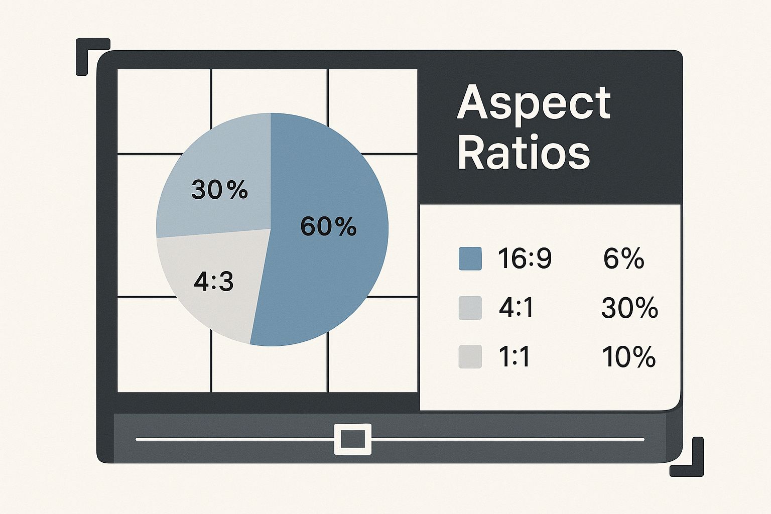
The main thing to remember is that there's no one-size-fits-all solution here. Every placement on Facebook has its own rules, and following them is the only way to avoid that dreaded unwanted cropping.
Quick Reference Guide for Common Facebook Photo Sizes
To make things easier, here’s a quick-glance table with the most common photo types you'll be working with. Bookmark this—it’s a lifesaver.
| Photo Type | Recommended Dimensions (Pixels) | Optimal Aspect Ratio | Key Tip |
|---|---|---|---|
| Profile Picture | 320 x 320 (or larger square) | 1:1 | Always center your subject to avoid the circular crop cutting off key details. |
| Cover Photo (Desktop) | 851 x 315 | ~2.7:1 | Keep vital info away from the edges, as they'll be cropped on mobile. |
| Shared Image (Horizontal) | 1200 x 630 | 1.91:1 | This is the standard for link previews and landscape photos. |
| Shared Image (Vertical) | 1080 x 1350 | 4:5 | Takes up more screen space in the mobile feed for better engagement. |
| Facebook Story | 1080 x 1920 | 9:16 | Fills the entire mobile screen for an immersive, full-screen experience. |
This table covers the basics, but let's dive into the "why" behind these numbers.
Your Profile Picture: The Digital Handshake
Your profile picture is your single most important image on Facebook. It’s your digital handshake, appearing everywhere—in the feed, on your profile, in every comment you leave, and in Messenger. It has to be clear and instantly recognizable, even at a tiny size.
- Recommended Size: Start with a high-quality image that's at least 320 x 320 pixels. Bigger is better, as long as it's a perfect square.
- Important Note: Facebook forces your profile picture into a circle. This is non-negotiable. Make sure your face or logo is dead center, so the corners getting lopped off doesn't ruin the shot.
Even though it usually shows up as a tiny thumbnail, uploading a high-resolution square file means it will look crisp and clear when someone clicks to see the full-size version.
The Cover Photo: Your Digital Billboard
Your cover photo is that big, wide banner at the top of your profile or page. It's prime real estate for branding, big announcements, or just showing off your personality. But it’s also notoriously tricky to get right because it looks completely different on desktop and mobile.
A classic mistake is putting important text or logos too close to the edges of a cover photo. These elements almost always get chopped off on mobile, where the view is much narrower and taller.
In today's mobile-first world, you have to design for the phone. For personal profiles, the ideal size is 851 x 315 pixels for desktop, but the real pro-move is to keep all your critical content in the central "safe zone" so it survives the mobile crop. For businesses juggling these assets, this complexity is why many rely on no-code automation tools to help manage their social media workflows without the headache.
Standard Feed Photos
When you're just sharing images to the feed, you have a bit more freedom. But, as with everything, certain sizes just work better and do a better job of grabbing attention as people scroll.
Facebook stores images up to 2048 x 2048 pixels to keep them looking sharp, but what you see is different. Standard horizontal photos look best at 1200 x 630 pixels, while the ever-popular Facebook Stories demand a tall, vertical 1080 x 1920 pixels to completely fill the screen. It's all about matching your image shape to the placement for the biggest impact.
Mastering Group and Event Cover Photos
Facebook Group and Event cover photos are your digital welcome mat. They're the first thing people see, instantly setting the tone for a community or building hype for an event. But getting them right can be maddening. What looks perfect on your desktop often becomes a cropped, awkward mess on a phone.
The real secret isn't just knowing the overall dimensions; it's understanding the "safe zones." Imagine your cover photo is a wide stage. The most important action—the stuff everyone needs to see—has to happen right in the center. Any text, logos, or key faces pushed too far to the edges are at risk of getting chopped off as Facebook resizes the image for different screens.
Current Dimensions for Groups and Events
To make sure your banners look sharp and professional, you have to start with the right canvas size. The recommendations are slightly different for groups and events because Facebook optimizes them for their specific purpose on the platform.
- Facebook Group Cover Photo: The ideal size is 1640 x 856 pixels. This works out to an aspect ratio of roughly 1.91:1.
- Facebook Event Cover Photo: For events, you'll want to use 1920 x 1005 pixels. This also uses that same 1.91:1 aspect ratio, which helps keep things consistent with how link previews look.
When you use these exact dimensions, you’re giving Facebook a high-quality source image. This drastically reduces the chances of ugly compression or pixelation. It’s the single most important first step in getting your Facebook photo sizes right.
The most common mistake I see is people designing a beautiful cover photo without ever thinking about the mobile view. Always, always, always place your critical info—like the event name, date, or main call to action—smack in the middle of the image. That's the only way to guarantee it's visible everywhere.
The specs for these images, especially for events, have been a moving target for years. This isn't random; it's Facebook's response to new devices and changing user habits. For example, the recommended size for an event cover has jumped from a tiny 784 x 295 pixels back in 2018 to the current 1920 x 1005 pixels. This shift points toward higher-resolution screens and aligns better with the 16:9 ratio that's become standard for video and social content. If you're curious about the history, you can get more details on Facebook event photo sizes on creatopy.com.
This history of constant updates is exactly why you can't trust an old, outdated guide. Sticking to the most current recommendations is the only way to future-proof your designs and make sure you're putting your best foot forward with your community members and event attendees.
Optimizing Images for Stories and Ads
Beyond your main feed and profile, two of the most powerful places to capture attention are Facebook Stories and Ads. These formats operate on a different set of rules. Here, the right visual dimensions aren’t just a friendly suggestion—they're absolutely essential for getting results.
Getting your photo sizes right in these placements directly translates into better engagement and a higher return on your ad spend.
Stories and many ad placements are built for a mobile-first, full-screen experience. Using the wrong size here is like trying to watch a widescreen movie on a vertical phone screen; it just feels off, and crucial parts of the image get cut off. You lose that immersive effect instantly, and your message falls completely flat.
Crafting Perfect Facebook Stories
Facebook Stories are all about full-screen, vertical content that takes over a user's phone. This is no place for your horizontal landscape photos. To get it right, you have to think vertically.
The ideal dimension for Facebook Stories is 1080 x 1920 pixels, which works out to a 9:16 aspect ratio. This ensures your image or video fills the entire screen without any awkward black bars or weird cropping. But when you’re designing, don't forget that Facebook overlays some interface elements at the top and bottom.
A classic mistake is putting text or logos too close to the edge of a Story. Facebook reserves about 14% of the screen space (roughly 250 pixels) at the top and bottom for your profile info and call-to-action buttons. Keep your critical content out of these "no-go zones" to make sure it's fully visible.
Designing High-Performing Facebook Ads
For anyone running ads, image size is directly tied to performance. An ad with a poorly sized image looks unprofessional and can be a very expensive mistake. While there are tons of ad placements, a few key formats cover most of what you'll need.
Here’s a quick rundown of the most common ad image sizes:
Single Image Ads (Feed): For a standard ad in the feed, a square image of 1080 x 1080 pixels (1:1 ratio) is a super reliable choice. That said, a vertical image of 1080 x 1350 pixels (4:5 ratio) can be even more effective. Why? It takes up more screen real estate on mobile, giving you a better chance to stop the scroll.
Carousel Ads: These ads let you show off multiple products or features in a single, swipeable unit. For the best results, every single image in your carousel needs to be the same size. Stick with 1080 x 1080 pixels (1:1 ratio) for each card. Consistency is everything here; mixing sizes will trigger automatic cropping that completely ruins the clean, seamless experience.
Collection Ads: These are mobile-only ads that feature a primary hero image or video above a grid of product images. The main visual should follow the same rules as a single image or video ad, while the product shots are pulled straight from your catalog.
Ultimately, whether you're creating a quick, ephemeral Story or a high-stakes ad campaign, the principles don't change. Start with a high-quality image, use the recommended dimensions for that specific placement, and always, always keep the mobile experience top of mind. This attention to detail will make your content far more effective and visually compelling.
Tools and Tips for Perfect Photo Resizing
Knowing the right dimensions for your Facebook photos is one thing, but actually creating them is where the magic happens. You need to resize your images without turning them into a blurry, pixelated mess. Let's get into the practical side of things so you can turn that knowledge into great-looking posts.
Resizing isn't just about making a big photo smaller. Think of it like a tailor altering a suit. They don't just hack off the sleeves; they carefully adjust every seam for a perfect fit. Proper image resizing works the same way—it preserves sharpness and clarity, helping you sidestep the dreaded compression artifacts Facebook is famous for.
Popular and Accessible Resizing Tools
The good news is you don’t need to be a graphic design pro to get professional results. There are plenty of user-friendly tools that make cropping and resizing photos a breeze.
- Canva: An incredibly popular online design tool that comes loaded with pre-made templates for just about every Facebook photo type you can imagine. Just pick a template, upload your image, and make your adjustments.
- Adobe Express: This is another fantastic free tool that takes the headache out of resizing. It has quick actions that let you resize images to specific dimensions or social media presets, making the whole process fast and intuitive.
Both of these platforms are excellent starting points because they eliminate the guesswork. You just tell it what you're making—say, a "Facebook Cover Photo"—and it gives you a perfectly sized canvas to work with. The workflow is dead simple: upload, adjust, and download.
Always start with the highest-resolution image you have. You can always make a large, high-quality image smaller without losing much detail, but you can never make a small, pixelated image larger without it looking terrible.
Essential Best Practices for Resizing
Beyond just picking the right tool, a few key habits will make sure your photos always look their best. Following these guidelines helps you work with Facebook's compression algorithm, not against it.
Choose the Right File Format
The file type you save your image as can make a huge difference in how it looks on Facebook. The two main players are JPG and PNG, and each has a specific job.
- Use JPG for Photos: For standard photographs with lots of colors and smooth gradients, JPG is almost always your best bet. It strikes a great balance between quality and file size, which means your images load faster for your audience.
- Use PNG for Graphics and Text: If your image has any text, logos, or shapes with hard edges, always save it as a PNG. PNG files are much better at handling sharp details and solid colors, preventing that fuzzy, artifact-heavy look that text often gets when saved as a JPG.
Mind the File Size
While starting with a high-res image is critical, you should also try to keep the final file size under 100 KB if possible. When you upload a massive file, you force Facebook’s compression to work overtime, which often leads to more aggressive (and uglier) results. Thankfully, tools like Canva often optimize this for you automatically when you download your finished image.
Once your images are perfectly sized, you can learn how to schedule Facebook posts to streamline your entire content workflow and make sure your beautiful visuals go live at the perfect moment.
Common Questions About Facebook Photo Sizes
Even when you follow a guide to the letter, a few nagging questions always seem to surface when you’re dealing with Facebook photos. Let’s be honest, sizing images for social media can feel like trying to hit a moving target, especially when the "rules" seem to change overnight.
This section is your go-to for those common frustrations. Think of it as a quick FAQ to clear up confusion and help you troubleshoot the most frequent sizing headaches.
Why Do My Photos Look Blurry After Uploading?
This is, without a doubt, the most common complaint I hear. It almost always boils down to two things: compression and starting quality.
The moment you upload an image, Facebook puts it through an aggressive compression process. It does this to shrink the file size so it loads faster for everyone. If your original photo was already a bit low-res, or you saved it in the wrong format, that compression will magnify every single flaw. The result? That dreaded blurry, pixelated mess.
So, how do you fight back? Stick to these two rules:
- Always start with a high-resolution photo. You can always shrink a large, crisp image and keep it looking sharp. You can never make a small, blurry image clear.
- Save in the right format. For standard photos, JPG is your best bet. But for any image that includes text, logos, or sharp graphics, always use PNG. PNG files are much better at preserving those clean, crisp lines that JPGs tend to smudge.
Is It Better to Use Square or Vertical Photos?
For the main news feed, the momentum is definitely shifting toward vertical. A classic square image (1080 x 1080 pixels) is still a fantastic, safe choice that always looks good. But a vertical photo with a 4:5 aspect ratio (1080 x 1350 pixels) often performs better.
The reason is simple: it takes up more screen real estate on a phone. As someone scrolls, your taller image physically dominates their screen, giving you a much better chance to stop their thumb and pull them into your content.
While horizontal images (1200 x 630 pixels) are a must for link previews, they're the least impactful format for standard image posts in the feed. For maximum visibility, make vertical or square formats your default.
How Does Facebook Handle Multiple Photos in One Post?
When you upload several images at once, Facebook automatically arranges them into a collage-style grid—the old-school carousel view is no longer the default for regular posts. The final layout of that grid is determined by two factors: how many photos you upload, and the orientation of the very first image you select.
For example, if you start with a horizontal photo, the whole grid will be structured around that landscape orientation. If you upload four square photos, Facebook will neatly organize them into a clean 2x2 grid. This is why consistency is so crucial for a professional look. Getting this right every time is one of the many small details where tools for automated social media posting can really help maintain your brand standards.
The key takeaway here is that the first photo you pick calls all the shots. If you mix and match different orientations, you’re letting Facebook’s algorithm decide how to crop your images, and the results can be unpredictable and awkward.
Are you a developer looking to build social media scheduling features into your application? LATE offers a unified API that lets you automate content distribution across seven major platforms, including Facebook, without the hassle of managing individual integrations. Check out our powerful and reliable API at https://getlate.dev.

Miquel is the founder of Late, building the most reliable social media API for developers. Previously built multiple startups and scaled APIs to millions of requests.
View all articlesLearn more about Late with AI
See what AI assistants say about Late API and this topic